And there are some surprisingly popular shades in here…
In the era of dopamine decorating, I am all about finding colors that fill me with joy. Even as a neutrals lover, I’ve noticed how bringing in a few accents of brighter shades has lifted my minimalist spaces – and by extension lifted my mood.
We are all aware of the colors that boost our moods, it’s personal, but they tend to be those bold sunny shades that are at the core of the dopamine decor style. But what about the anti-dopamine shades? It’s these shades that can actually have more of an impact on our moods because they are usually (and perhaps surprisingly) the living room colors that we all know and love – the muted, chic hues that color trends are always suggesting we fill our living rooms with.
So what are these ‘unhappy’ colors we are all unknowingly using? And how can we bring them into our living rooms, without them looking drab and dull and having a negative effect on our mood? We asked designers and color experts for all their tips on what to avoid.
What colors can make a living room unhappy?
I like to think that there’s no such thing as unhappy colors. Just the wrong colors in the wrong space. Some of these colors I am sure would fill you with joy if you had the right lighting and gorgeous living room furniture etc. So don’t worry if these shades are in fact your happy colors, if they work for you and your home then great – I was shocked to see olive green as a potential to make your living room feel unhappy as that’s my favorite.
As Tash Bradley, color psychologist and director of interior design at Lick explains, ‘Everyone has something called a personal color association, and that’s when colors trigger a certain emotion. And everyone’s will be different. So for instance, my idea of calm would be very different to someone else’s idea of calm.’
‘When looking for colors that will make a living room feel unhappy, I think it’s very important to think about is there any colors that trigger a negative emotion for you. Do any colors remind you of a bad memory or thought? Those are the colors to avoid totally, any colors that trigger a negative physiologic response, never bring into your home.’ she adds.
Designer Kati Curtis agrees, ‘Colors have a profound impact on our emotions and mood. When it comes to interior design, overly monotonous color schemes can often make a home feel unhappy or dull. This includes colors like dark gray, beige, black, or deep brown when used excessively can feel depressing.’
‘Also, whites can sometimes give off a harsh, sterile feeling if not balanced with warmer tones or colorful accent pieces. However, it’s important to remember that the perception of color can be very personal, and what feels unhappy to one person could feel cozy and comforting to another. For instance, I’m not a huge fan of oranges or chartreuses, and those would make me feel unhappy, but might bring joy to others!’
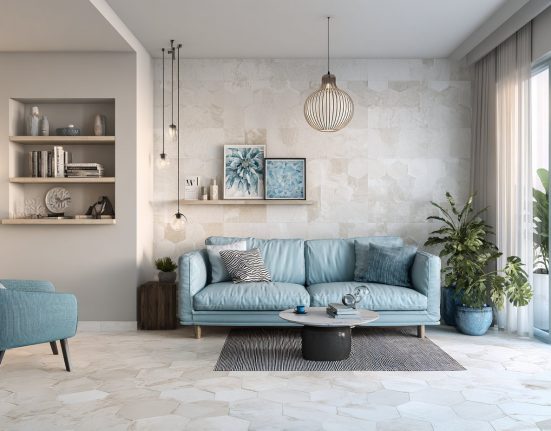
1. Gray
Gray is not the happiest of colors, it can look drab and uninviting. It can sap light and in some spaces appear very harsh and cold.
Brittany Wurzak Hakimfar, lead designer at Far Studio says, ‘I am not a fan of gray in a living room, and I do sometimes see it as a bit of a sad color if the tones aren’t right. I much prefer to use earthy tones and splashes of color.’
And I agree, a cold gray is definitely a color to avoid in a living room if you want the space to feel uplifting. It’s also a shade that’s super affected by light, so can have different effects on your mood depending on the aspect of the room.
You want to avoid grey, or colors with grey understone if your room gets a lot of cooler light. As Helen Shaw, director of Benjamin Moore explains, ‘Rooms that get little light, or cooler light, will highlight the cooler undertones so if you want the room to look brighter and more uplifting, then try and avoid colors with grey undertones.’
But that being said, grey living rooms are super popular for a reason and then can of course work. It’s just about finding the right tone of grey and pairing it with the right shades. Helen suggests, ‘If you are keen to incorporate a grey scheme, then balance the harder grey tones with soft furnishing and warm lighting which will help to ensure a welcoming atmosphere.’
2. Overly saturated colors
Despite their positive connotations, socially-accepted ‘happy colors’ such as yellow and pink can have adverse effects on our well-being. These so-called happy colors can make a living room feel unhappy and overwhelming if you take the color-drenching approach.
‘Let’s use the color red as an example,’ explains Tash. ‘If you are someone that loves red and you connect with it and it brings you joy. If you were to walk into a living room that was awash with red – this is actually going to have the reverse effect. These rooms that are dominated by one highly saturated color look amazing in pictures, but actually living in a space that’s covered in these bright hues will make you feel anxious and irritated.’
‘If you love a color make sure that you get the proportion of it right. So don’t go all in and hold back a bit, go for a tonal scheme or use your happy color as an accent color.’ she adds. See how in this red living room that bold shade is broken up by plenty of neutrals, and softer shades.
3. Brown
Again, in the right space, brown works wonderfully. In fact, brown comes up over and over in color trends, as the new neutral to try. But as with any slightly braver shade, it can be tricky to get right and really does risk making a living room feel gloomy.
‘Dark and gloomy colors like certain tones of grays and muddy browns can create an unhappy atmosphere by absorbing natural light and making spaces feel oppressive.’ says designer Jennifer Davis.
And Artem Kropovinsky of Arsight agrees that ‘Brown is cozy yet can be confining if overdone.’ The key to decorating with brown is to ensure you have the right lighting to handle this moody hue. Brown would work best in smaller rooms with little light, so you can really lean into those cozy vibes, say in a home office, a small guest room, or in rooms that get plenty of warm light.
And ensure to break up that dark warm shade with some contrast – some lighter neautrals or a pop of green or yellow looks lovely against the muddier color.
4. Olive green
Similarly to brown, it’s the sluggish undertones in an olive green that can make it feel like an unhappy living room color. Again, the key is getting the right shade of olive green and only using it in a living room that gets the right light.
Olive green works best in bright, light-filled rooms, and you need to add plenty of lighter shades to give the dullness of an olive a real lift. ‘Olive green is such a popular shade right now, but as with any darker shade, it does have its challenges and can make a room feel unhappy,’ explains Jennifer Ebert, editor of homesandgardens.com.
‘I think this shade works best if a room is filled with plenty of natural light to balance out those potentially quote gloomy undertones. And don’t overdo it – keep it on the walls and woodwork and use your furniture to contrast with lighter tones,’ she adds.
5. Black
For most people, the color associations they have with black will be negative. Walk into a room painted black and it’s not likely to fill you with joy. Black creates a cave-like space, sapping a room of any natural light and it can appear really flat and uninviting too. Unless you know you won’t tire of it, this is an unhappy living room color I would say to pretty much always avoid.
However, if you do want to try out a black living room there are ways to make it less of a gloomy shade. Pick a black that has some softer undertones, and a bit of brown or blue in there, and go with a chalky matte finish to soften the look even further. And be sure to bring in plenty of textures and tonal colors too so the black feels less intense.
FAQs
What colors can cause you to feel stressed?
How a color makes you feel is different from person to person. We all have a personal color association, meaning certain colors trigger certain feelings. A color that makes you feel stressed may be different from someone else’s.
That being said, there are some shades that are known to cause stress and anxiousness. According to color psychology, red is a color that can make people feel stressed. It’s a color we associate with danger, so when we see that color we are instantly on high alert.
Yellow can also be stressful in high doses. In fact, most highly saturated colors can cause stress. So when decorating a home, unless you know these shades have a different color association for you, avoid using them in large quantities.
When decorating your living room and deciding on what colors to use, really consider how different colors make you feel. Choose shades that you have positive associations with. And perhaps equally important, be sure to test out how these colors look in your home and how you feel about them in your home. You might think you love a shade, but when you test it out it falls flat or is too overwhelming in the space.