If you want your living room to feel more cozy, calming and inviting, consider these expert-recommended palettes
At the end of the day, we all want a home that is tranquil, relaxing, and calming. In a world that is often overstimulating, a home offers that promise of peace, away from all the noise.
Many paint brands, designers, and color consultants have told me about a shift towards muted, refrained, minimal interiors and design choices. Comfort and solace are of prime importance indoors, and the right palette can conjure that mood.
If you’re in the middle of a renovation or are designing your home from scratch, and want to have a space that is timeless and always cozy, then these expert-recommended hues are for you. Start with browsing through these living room color ideas dipped in serenity and quietude. Are you already feeling less anxious?
How can I use color to make my living room feel more calming?
Largely, a neutral living room offers up a great opportunity to create a calming scheme, upon which you can layer more muted tones to cozy up the space.
‘When creating a calming and serene atmosphere, we like to feature lighter colors in soothing blues, greens, or any pastels,’ says Los Angeles-based Victoria Holly, founder and principal of Victoria Holly Interiors. ‘Really, any color can be calming as long as it is light and bright. Usually, the eye perceives things as calming when it doesn’t need to work a lot, which is why light and bright tones are relaxing.’
1. Consider a tactile scheme with blush tones
A pink living room drenched in light, blush tones has an instantly welcoming feel. Pink is timeless and is rich with a wide variation of undertones and shades. A warmer pink with perhaps a brown or grey undertone can help make your living room feel more grounded and earthy.
If you’re not sure about committing to the color, you could start small and introduce small pops of blush into a space with pillows and a rug. This is a great accent color and will go very well in a room that is essentially brown, grey, or white. A lovely way to play up this tone is with hints of metallics, but if it’s a calming scheme you want, then keep the metallics to a bare minimum. Ensure your lighting is a warm yellow and not a cool white, so the overall vibe is relaxed and tranquil.
‘An earthy tone lime wash pink was chosen for the interior and exterior walls of the house,’ says Andrew Trotter, founder of Studio Andrew Trotter. ‘Based on this choice, the floor material and furniture were chosen, always seeking to achieve an air of lightness and calmness.’
2. Bring in nature-inspired hues
Nature and its colors have an organic allure and can help build a calming, elegant living room that always feels fresh and welcoming. Most colors that you can think of are already available in nature; the key then is to find the right combinations.
Think blue-green that reminds you of the earth and sky, or pink and red that are reminiscent of a blooming garden. Choose the softer tones of all hues so the interior doesn’t feel overwhelming.
‘We chose this lovely beige-green scheme for the living room as the space overlooks a park with lots of trees, and we wanted to create an indoor-outdoor feeling,’ says interior stylist Tone Kroken.
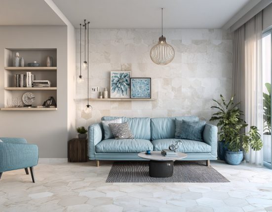
3. Light tones can make a space feel open, breezy yet embracing
A light blue living room is a cool color, but it doesn’t give you the chills. It instantly conjures visuals of the sea and the sky. The softer the tone, the more light-reflecting abilities it will have, making the room feel open, breezy, and inviting. If it’s a calming interior you’re going for, try not to break the harmony of the light tone by adding pop colors or other intense tones. However, white and pastels are always a good accompaniment with cool tones.
‘Though a small minority of folks find blue to be melancholic, and some don’t like green, these are most closely associated with calmness,’ says Amy Krane, architectural color consultant and founder of Amy Krane Color. ‘To be more specific, we’re talking about cool blue-greens as warmer yellow greens can be energizing. Neutrals like greys, beiges, whites, and creams can also create a calm environment as will more monochromatic color schemes. The more variety the more excitement you add to the color palette and the mood of the room.’
4. A dark scheme can create depth and coziness
There’s something surprisingly calming about a dark-toned interior. These colors give a room weight, depth and conjure an enveloping feel, as if cocooned in a warm hug. Think moody blues, teals, mossy greens, terracotta reds, burnt oranges, or even black living rooms.
The way to use deep tones (without being nervous or unsure about them!) is by approaching them as neutrals. Don’t focus on the color but think of it as a base tone. Color drenching it might help, as it will take over the interior, and in a sense, merge with it. Dark tones with cooler undertones suit south-facing rooms, while warmer tones work best with north-facing light. Upon these, you can layer softer tones to open up the space.
5. Earth tones create an anchored feel
From rich clays, and muddied greens, to vibrant mineral shade and more, earth-tone living rooms can set a mood that’s soulful and tranquil. This timeless (and currently trending) color palette is grounding and reduces stress.
If you worry that a single, solid earth tone will bring the overall vibe of the room a bit down, you could consider interesting combinations of grounded tones, so they, together help create a more upbeat look without being overwhelming. Think sage, clay, and ivory as a pairing with soft blue accents. This combination can create a serene and organic environment. Another great coupling is with crimson, brown and white that is both bold, yet deeply calming.
Forest brown, black, and olive, or dusty mauve and beige too can look wonderfully minimal and extremely sophisticated.
‘I love muted rich colors that bring warmth and comfort to a space, particularly shades of brown, sage, and sienna,’ says Jake Arnold, founder of Studio Jake Arnold. ‘This color brings a warmth and coziness to a space, and is gloriously timeless.’
If you’re looking for inspiration, nature can be your best friend. From rich clays to lush greens to earthy browns, some of the best color palettes are found right outside your front door.
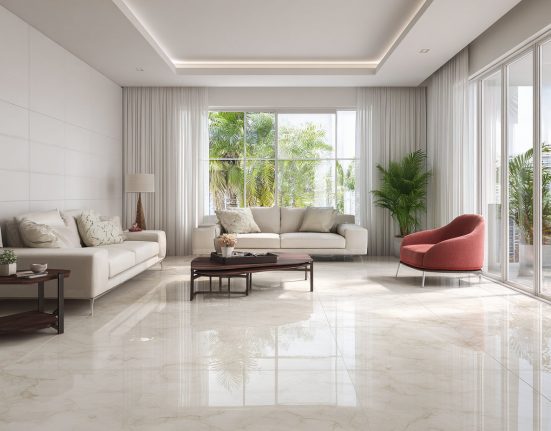
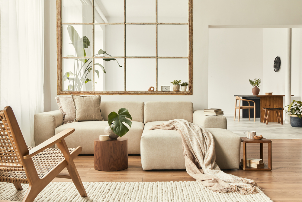
6. Opt for warm neutrals for a clean yet inviting scheme
Nothing beats the look of a warm white, light grey, or cream living room; the ultimate neutrals that are always on-trend, and never allow an interior to feel boring. Plus, these provide the unique opportunity to layer the room with texture, prints, and more colors. For a soothing scheme, however, consider layering the room with more neutrals, or better still, material tones that ensure the space feels relaxing.
If you’re going for neutral walls and are worried it might look too one-dimensional, consider interesting paint finishes. Perhaps a lime wash will give the room some movement. Or even a textured, cream wallpaper can do the job. Add black or charcoal grey as accents so the room doesn’t stray too far from a monotone palette yet has character.
‘The space was designed to celebrate the existing features of the Victorian property, whilst introducing a calm and warm aesthetic feel,’ says Jonty Hallett, founder of Studio Hallett Ike. ‘Existing floor boards were sanded and stained to reveal the natural grain and the cornice, being a unique and original feature, was highlighted by bringing the wall finish up to a ‘picture rail’ height. The natural light was enhanced by using a textured wall finish to capture the movement of light and shade.’
‘To ground the palette, we designed bespoke blackened steel furniture to suit the exact sizes,’ says Jonty. ‘Two side units nestle either side of the existing fireplace, and a simple yet sculptural coffee table draws the eye. Art was carefully selected to continue the warm and neutral tones throughout, and a Serge Mouillemetal ceiling lamp balances the design.’
7. Jewel tones can make a living room feel high end yet calming
If you’re wondering how to decorate with jewel tones, you’ll be surprised how versatile these are. For those looking to create therapeutic interiors, jewel tones could be just what you need to give your home a lift-me-up. Deep greens, luscious purples, reds, golds, and silvers look striking yet are comforting, and when used in the right quantities, can make your space feel cozy.
One tip to keep in mind while using jewel tones is that you want to use the deeper incarnations of these hues, especially if you’re using more than one in a space. The deeper the jewel tone, the less they’ll compete with one another, so pick your favorites and go for it.
‘This living room was designed for a vibrant young family who wanted to inject color and live in their new period home while still having a neutral backdrop to the spaces so they could evolve,’ says Róisín Lafferty, founder of Kingston Lafferty Design. ‘The base palette of the greenish grey jewel tone was used throughout the living space on the walls, ceiling, doors, and woodwork and joinery. They allowed the space to be bold, while the pendant and colorful side tables also make an impact.’